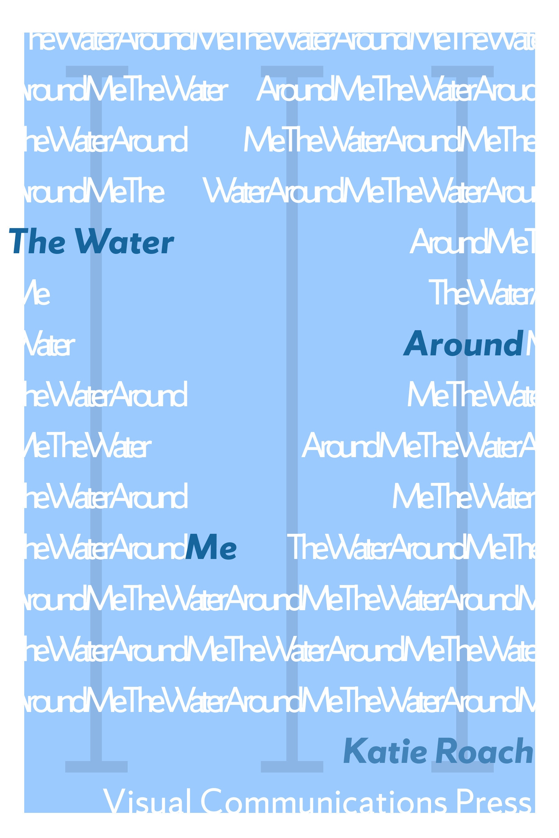
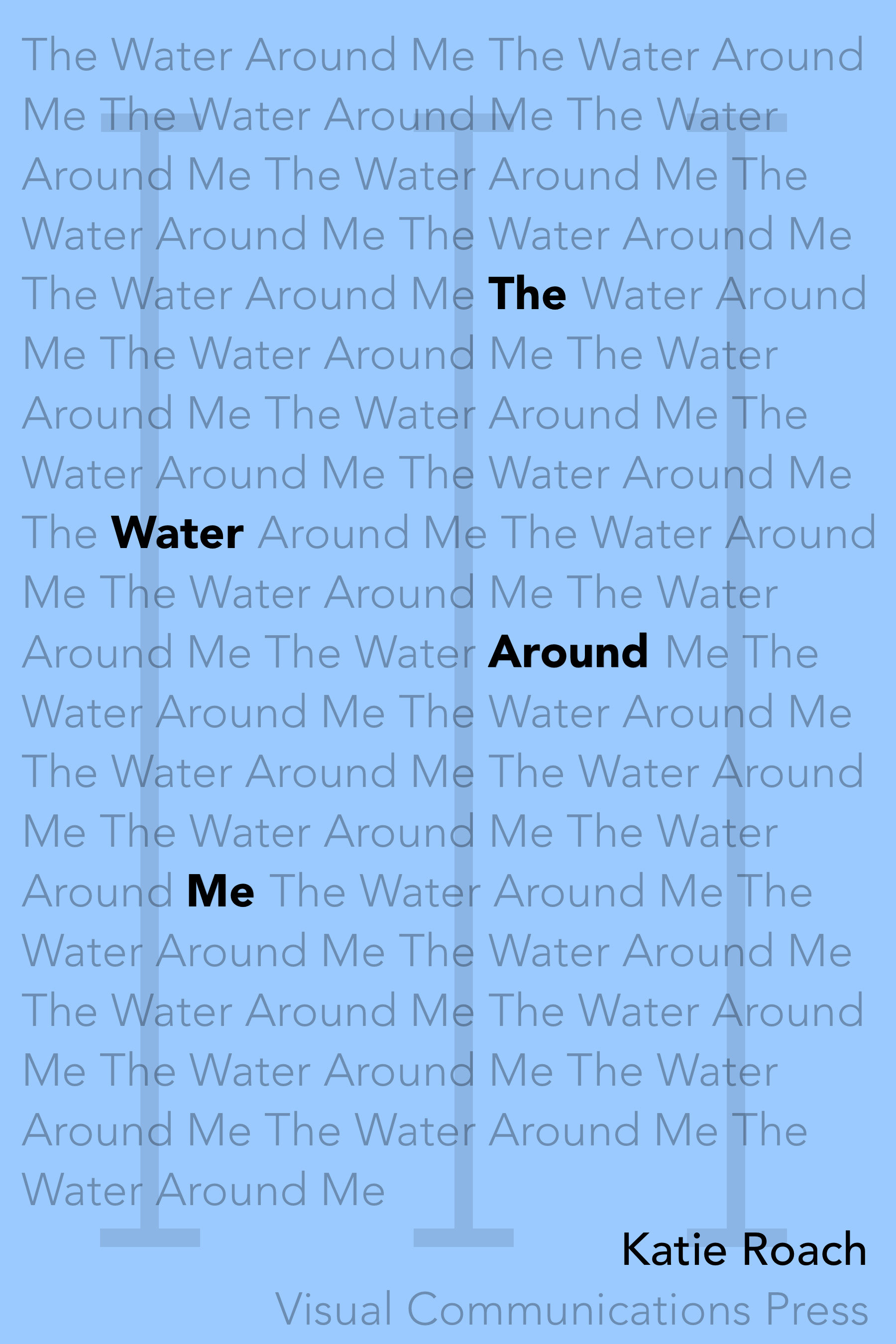
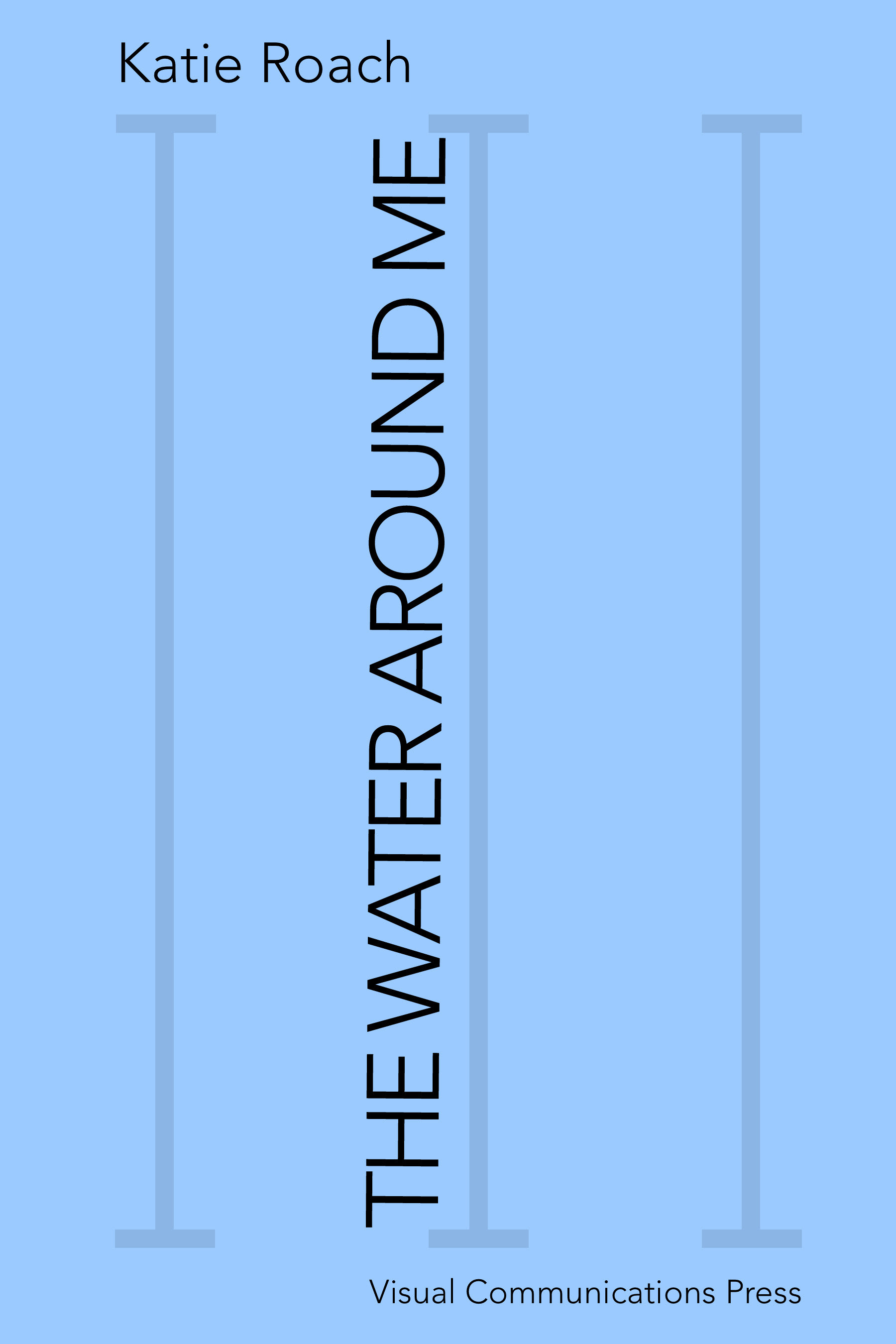
Using only type, I created 7 different book covers that met varying requirements related to type such as typeface, size, line spacing, weight and color. As a swimmer, I decided my hypothetical book would be a memoir of my experience in the sport.
This project was meant to teach us the importance of type, since images typically steal the show in a design. To the left is my design I am most proud of.
For this book cover, I started with the lines in the back to represent the lines on the bottom of a pool. I made these out of repeating the title, "The Water Around Me". Using color, I balanced it out to include a production company and my name. In that same color, I typed out the title in bold and capital letter and lowered the opacity. For visual depth, I overlapped the letters then grounded them by having them run off the edges.


The covers above are my first four. For these covers we were only allowed to change one of the following things: linespacing, weight, color or size. For the far left I changed the weight, for the second one I changed the size, third I changed color and fourth I changed size again.
To be able to create engaging type with such strict requirements, I changed things like the opacity, kerning, tracking, rotation and centering.
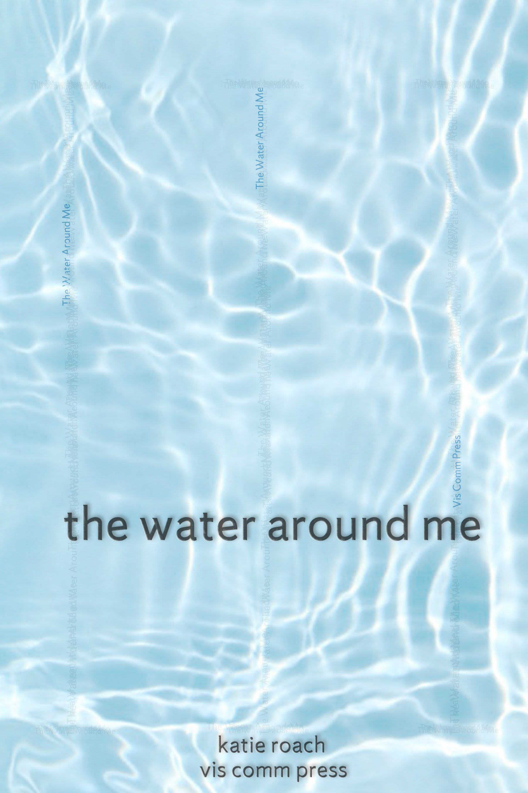
For the cover below to the left, I was allowed to change two elements. I changed